
improve conversion rates
How to improve website conversion rates: Quick Wins
Posted on Nov 13, 2025
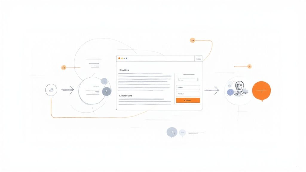
Improving your website conversion rate really comes down to one thing: making it dead simple for visitors to do what you want them to do. It’s a mix of smart design, persuasive writing, and a little bit of user psychology. The best strategies I've seen all focus on the same core ideas—getting rid of friction, building trust, and creating an obvious path from the moment someone lands on your site to the moment they click "buy" or "book now."
The Foundation of a High-Converting Website
Before you start obsessing over A/B testing button colors or rewriting every call-to-action, you need to get the foundation right. Think of your website less like a digital brochure and more like a guided tour. Every single element, from the headline they see first to the final click, has to work together to solve their problem and make them feel confident they’ve made the right choice.
Understanding that journey is the real first step. It's not about chasing some arbitrary number; it’s about making the user's experience better. Sure, a "good" conversion rate is typically between 2% and 5%, but that number can be all over the place depending on your industry. The real goal is to keep making small, data-driven improvements over time.
Core Pillars of Conversion
To build a site that actually converts, you have to nail three fundamental things. These principles hold true whether you're selling a product, trying to get leads, or just want more email sign-ups.
- Clarity and Simplicity: Your value proposition has to be crystal clear, instantly. A visitor should know exactly what you do and why it matters within seconds of landing on your page. Ditch the jargon and confusing navigation—don't make them think.
- Trust and Credibility: People buy from businesses they trust. You build this with a professional design, upfront pricing, real customer reviews, security badges, and easy-to-find contact info. It’s all about showing you’re legitimate and reliable.
- A Seamless Path to Action: Every page needs a purpose that pushes the user one step closer to converting. Cut down the number of form fields, make the checkout process foolproof, and design your CTAs so they’re impossible to miss.
A website conversion happens when a user completes a desired action, but the real magic is in what happens before that click. The journey—the user experience—is what ultimately determines your success.
Understanding User Intent
At the heart of every conversion is user intent. You have to ask yourself: why is this person on my site right now? Are they just kicking tires, are they comparing me to a competitor, or do they have their credit card out, ready to go?
Knowing the answer helps you shape your message and design to meet them where they are.
For instance, someone who lands on your site from a search like "best short-term rental management software" is probably in evaluation mode. That page needs to immediately hit them with key features, competitor comparisons, and social proof. To really lay a strong foundation for a high-converting website, it's essential to understand the core principles of conversion rate optimization best practices. This ensures every decision you make is grounded in proven strategies that work with user psychology, helping turn casual visitors into paying customers.
To make these concepts more tangible, here's a quick rundown of the most effective strategies we'll be diving into. This table summarizes the key tactics that can give you an immediate lift.
Key Strategies for Immediate Conversion Uplift
| Strategy | Area of Focus | Potential Impact |
|---|---|---|
| A/B Testing CTAs | User Engagement | 10-20% increase in clicks |
| Simplify Forms | Lead Generation | Reduce friction; boost submissions by 15% |
| Add Social Proof | Trust Building | Increase credibility and conversion by up to 34% |
| Optimize Page Speed | User Experience | Every 1-second delay can drop conversions by 7% |
| Personalize Content | Relevance | Improve engagement and guide users effectively |
Each of these strategies tackles a specific part of the user journey, from building initial trust to removing that final bit of friction before the conversion. We'll explore how to implement each of these in the sections ahead.
Using Data to Drive Smarter Decisions
Relying on a gut feeling to make changes to your website is one of the quickest ways to tank your conversion rates. It’s a common mistake. But the most successful businesses don't guess; they test. This is where a data-driven mindset, with A/B testing at its core, can turn your website from a simple online brochure into a booking powerhouse.
A/B testing, or split testing, is a pretty straightforward—but incredibly powerful—method. You create two versions of a single element on your site, like a headline or a call-to-action button, and then show them to different segments of your audience at the same time. By simply measuring which version drives more conversions, you get undeniable proof of what actually works, not just what you think works.
This process strips away the guesswork and lets you make small, smart improvements that compound over time, leading to a serious lift in bookings and inquiries.
Building Your First Test
Every effective A/B test starts with a solid, clear hypothesis. This isn’t just a random idea; it’s a specific, testable statement that predicts a certain outcome. I’ve always found it helpful to stick to a simple structure: "If I change [X], then [Y] will happen, because [Z]."
Let's walk through a real-world example for a short-term rental website:
- Observation: "Our 'Book Now' button isn't getting many clicks, even on property pages with a lot of traffic."
- Hypothesis: "If we change the CTA button text from 'Book Now' to 'Check Availability & Rates,' we will increase clicks by 15% because the new text feels like less of a commitment and is more helpful for guests who are still in their planning phase."
That’s a perfect hypothesis. It clearly states what’s changing, predicts a measurable result, and explains the reasoning behind it. Using this framework forces you to get inside the head of your potential guests.
Prioritizing What to Test for Maximum Impact
You can't test every single thing on your site at once, so you have to be strategic. The key is to focus on high-impact areas first. These are usually the elements on your most critical pages—like your homepage or individual property pages—that have the biggest sway over a visitor's decision.
To get the most bang for your buck, start with these high-leverage items:
- Headlines and Value Propositions: This is the very first thing visitors see. A great headline that instantly communicates the value of staying at your property can dramatically lower your bounce rate.
- Calls to Action (CTAs): The wording, color, and even the placement of your buttons are all fair game. Test action-oriented language (like "Reserve My Spot" vs. "Submit") to see what truly motivates your visitors to click.
- Page Layout and Hero Images: The main image on a property page can make or break a booking. Try testing different shots—a stunning exterior photo versus a cozy interior view—to see which one grabs more attention and pulls people in.
The goal isn't just to run tests; it's to learn from them. Every test, whether it wins or loses, provides valuable insight into your audience's behavior and preferences.
Systematically testing your landing page designs is one of the most reliable ways to improve website conversion. Data from VWO shows that this process can boost conversions by an average of 12%. It proves that even minor tweaks, like button colors or the placement of a form, can have a real-world impact. For instance, click-based campaigns often see a median conversion rate of 11.3%, while lead-gen forms average around 4.1%, which shows just how much different goals require different optimization strategies.
Understanding the Numbers
Once you’ve run a test long enough, you'll have your data. But how can you be sure the results are real and not just a random fluke? That's where statistical significance comes into play. In simple terms, it's the probability that your result wasn't just due to chance. Most testing tools will aim for a 95% confidence level, which means you can be 95% sure that the outcome is repeatable.
Whatever you do, don't end a test early just because one version seems to be winning. You need to collect enough data from a large enough sample size to make a confident call. Once you have a statistically significant winner, roll out the change and move on to your next hypothesis. Tracking these small wins is fundamental, and you can learn more about connecting these efforts to your bottom line in our guide on how to measure marketing ROI. This constant cycle of testing, learning, and implementing is the true secret to conversion rate optimization.
Optimizing User Experience and Site Speed
A frustrating website is a direct path to lost bookings. If your site is slow, confusing, or just a pain to use, potential guests will leave without a second thought. This is where user experience (UX) and site speed become undeniable factors in your ability to convert visitors into paying customers.
This image isn't just a bunch of technical jargon. It shows Google's Core Web Vitals, which are critical metrics that measure the real-world experience of your site—loading, interactivity, and visual stability. If you're serious about getting more bookings, paying attention to these signals is non-negotiable.
Make Your Website Effortless to Use
Think about the last time you landed on a clunky website. Did you stick around to figure it out, or did you just hit the back button? Most people leave. A seamless user experience isn't a luxury; it’s a core requirement.
Your goal is to eliminate friction at every single touchpoint. This means creating a navigation structure so intuitive that users don't even have to think about where to go next. For short-term rental sites, this boils down to a few key things:
- Logical Property Groupings: Organize your listings by location, property type, or popular amenities. Don't make people hunt for what they need.
- A Prominent Search Bar: Your search function should be front and center, with smart filters that help narrow down options quickly.
- Clear Calls to Action: Every page needs to guide the user to the next logical step, whether that's viewing a property, checking availability, or getting in touch.
For vacation rental managers, a well-structured site is your most powerful sales tool. You can dive deeper into these principles with our guide on effective vacation rental website design to ensure your online presence is actually built to convert.
Embrace a Mobile-First Design
It's no longer enough for your website to just "work" on mobile; it needs to be designed for it. The vast majority of travelers are browsing and booking on their phones, which means a mobile-first approach is essential. You should be designing the mobile experience first, then adapting it for larger screens—not the other way around.
A great mobile experience requires more than just a responsive layout. You need to think about:
- Thumb-Friendly Buttons: Are your CTAs and interactive elements large enough to be tapped easily without zooming in?
- Simple Forms: Nobody wants to fill out a long, complicated form on a tiny screen. Keep your fields to the absolute minimum.
- Readable Text: Use large, clear fonts that don't force users to pinch and zoom just to read a property description.
A seamless mobile experience isn't about looking pretty; it's about accessibility and convenience. If booking a stay is a hassle on a phone, you're shutting the door on a massive portion of your audience.
The Critical Role of Website Speed
Nothing kills conversions faster than a slow website. We live in a world of instant gratification, and every single second counts. Google’s Core Web Vitals have made page speed a direct ranking factor, but more importantly, it's a huge factor in user satisfaction and your bottom line.
Optimizing your site's speed is one of the most impactful things you can do. Consider this: for every 1-second improvement in page load time, conversions can increase by up to 2%. That's not just a theoretical number. Walmart saw a 2% conversion increase for every second they shaved off their load time, which translated into millions in new sales.
How to Streamline Your Checkout Process
The checkout page is the final hurdle. It’s also where a staggering number of potential bookings are lost due to unnecessary friction. A study by the Baymard Institute found that 19% of users abandon their cart simply because the checkout process is too long or complicated.
To slash your cart abandonment rate and guide users smoothly to the finish line, you have to simplify this final step. Here are a few strategies that work:
- Offer a Guest Checkout Option: Forcing users to create an account is a major conversion killer. Always provide an option to check out as a guest to capture those who are in a hurry.
- Minimize Form Fields: Only ask for the information you absolutely need. Every extra field is another reason for a user to give up.
- Display Trust Signals Prominently: Show security badges (like SSL certificates) and accepted payment logos. This reassures users that their financial information is safe with you.
- Show a Progress Bar: For multi-step checkouts, a visual progress bar lets users know where they are and how much is left. It manages expectations and makes the process feel less daunting.
Crafting Irresistible Calls to Action
Your Call-to-Action (CTA) is the tipping point of your entire website. Seriously. It's that make-or-break moment when a visitor decides to either take the next step or just… leave. All the hard work you poured into your design and copy can go down the drain with a weak, uninspired CTA. But a powerful one? That can be a game-changer for your conversion rates.
Stop thinking of your CTA as just a button. It's the final, persuasive instruction you give a potential guest. It has to be crystal clear, compelling, and perfectly timed with what they want to do next. This is where you connect their problem (finding the perfect stay) with your solution in a single, satisfying click.
The Psychology of a Click
So what’s the difference between a CTA that gets clicked and one that gets scrolled past? It usually boils down to a few key psychological triggers. Your goal is to squash any hesitation and make the decision to act feel both incredibly easy and rewarding.
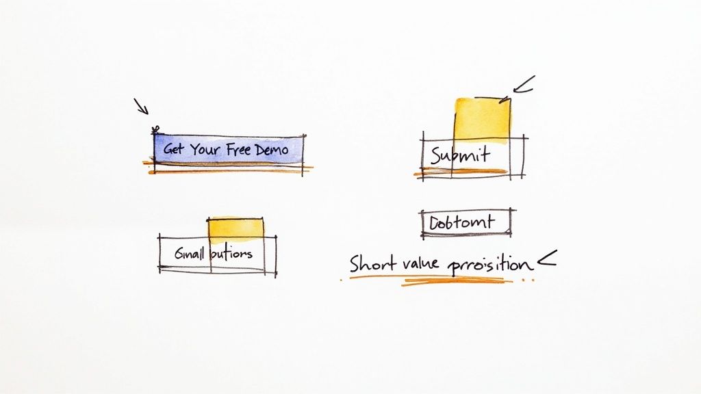
Action-Oriented Language: Kick things off with strong, benefit-driven verbs. Ditch passive words like "Submit." Instead, use language that hints at a positive outcome for the user, like "Get Your Free Quote" or "Reserve My Spot." The words should feel active and all about them.
Visual Prominence: Your CTA button needs to pop. Use a color that contrasts sharply with your site's background—it should practically jump off the page. Don't be shy; make it one of the most vibrant elements. You want it to be impossible to miss.
Strategic Placement: Put your CTAs where they just make sense in the user's journey. That often means having one right there "above the fold" on key pages and then repeating it after you've laid out more info. A guest should never have to hunt for what to do next.
More Than Just a Button
A truly effective CTA is more than a slick button design; it's the grand finale of a compelling argument. The words around it—the headline, the sub-headline, the body copy—all need to work in concert to build desire and eliminate any lingering doubt.
Before anyone clicks, they're subconsciously asking, "What's in it for me?" Your copy needs to answer that question, and fast. Frame your entire offer around the benefits they'll get, not just the features of your property.
A great CTA doesn't just tell users what to do; it reminds them why they should do it. It’s the final nudge that turns interest into action by reinforcing the value they are about to receive.
Crafting High-Impact CTA Copy
Writing CTA copy that works is definitely an art form. You have to be concise, clear, and persuasive, all in just a few words. Let's look at a few simple frameworks to turn a generic button into a booking machine.
Before and After Scenarios
| Generic CTA | High-Converting CTA | Why It Works |
|---|---|---|
| Submit | Get My Free Itinerary | This is specific and highlights a tangible benefit. The word "My" makes it feel personal. |
| Sign Up | Start My 14-Day Free Trial | This one clarifies the offer immediately and removes risk by flat-out saying it's free. |
| Learn More | See Pricing and Plans | Much more direct. It answers a specific question the user probably has right at that moment. |
See the pattern? These examples all pivot from generic commands to value-focused invitations. Every improved version speaks directly to the user's goal, making that click feel like the most logical and beneficial thing they could possibly do.
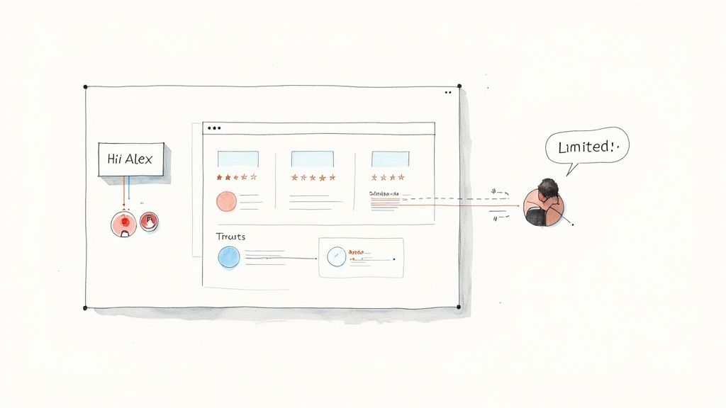
Creating a Sense of Urgency
Sometimes, people just need a little nudge to act now instead of "later." Creating a sense of urgency can be a powerful motivator, but you have to keep it authentic. Fake countdown timers and cheesy pressure tactics just feel dishonest and can backfire.
Instead, focus on genuine scarcity or time-sensitive offers that are actually real:
- "Only 2 spots left at this price!" This leans on real inventory scarcity to spur immediate action.
- "Offer ends Friday." A hard deadline gives people a concrete reason to make a decision quickly.
- "Book now to lock in your dates." This approach highlights the potential loss of their preferred booking if they hesitate.
When you combine powerful verbs, a clear value proposition, and a touch of genuine urgency, you create an environment where clicking your CTA feels like the smartest, most natural thing to do. This is a foundational step in mastering how to improve your website's conversion rates.
Building Trust with Personalization and Social Proof
Today's travelers don't just want a website; they want an experience. A generic, one-size-fits-all approach just doesn't cut it anymore. If you're serious about boosting your conversion rates, you need to get good at two things that build instant trust: personalization and social proof.
Think about it. When a visitor feels like your website just gets them, they're much more likely to stick around and book. That’s personalization in a nutshell. And social proof? It's the ultimate shortcut to credibility, showing hesitant visitors that plenty of others have booked with you and had a fantastic time.
Making Every Visitor Feel Seen
Real personalization goes way beyond just dropping a visitor's first name into an email. It’s about creating a dynamic website that adapts to their behavior, what they like, and where they've clicked before. Even small, thoughtful touches can make your site feel way more intuitive and helpful.
For instance, if someone keeps looking at your beachfront properties, why not greet them with a homepage banner showcasing your best coastal rentals on their next visit? It's a simple tweak, but it makes your site feel smarter and guides them right to what they want. More advanced tools can even adjust pricing or highlight specific amenities based on user data. If you want to dive deeper, we have a complete guide on https://gethostai.com/blog/what-is-website-personalization.
Here are a few practical ways to get started:
- Dynamic Content: Show different headlines or offers to different people. A first-timer might see a "Welcome" discount, while a loyal guest gets an exclusive "Welcome Back" rate.
- Personalized Recommendations: Add a "You might also like" section to your property pages. If someone is browsing family-friendly homes with pools, don't show them a one-bedroom downtown loft.
- Location-Based Targeting: Greet visitors with properties in their local area or a popular nearby destination. It creates an immediate sense of relevance.
When done right, good personalization feels less like marketing and more like a helpful concierge. It anticipates what your guest needs and smoothly guides them to the perfect property, making the whole process easier.
The Undeniable Power of Social Proof
Let's be honest, people are wired to follow the crowd. We look to others to figure out what's good and what's not, especially when we're about to spend money. This is the core of social proof, and it’s your secret weapon for building trust and calming those pre-booking jitters. In fact, one study found that just showing reviews can boost conversion rates by a staggering 270%.
Put yourself in a guest's shoes. Booking a vacation rental feels like a bit of a gamble. Will it look as good as the photos? Is the host reliable? Social proof answers all these questions by showing them that other people took the chance and loved it.
How to Strategically Display Social Proof
Having great reviews is one thing, but you have to show them off where they'll actually make a difference. The idea is to create a constant, reassuring hum of credibility from the moment a visitor lands on your site to the moment they click "Book Now."
Here’s how to do it:
- Customer Testimonials: Sprinkle glowing quotes from past guests on your homepage and key landing pages. Use their name and maybe even a photo to make it feel more authentic.
- Star Ratings and Reviews: Don't hide your stars. Integrate them right into your property listings and let people filter their searches by the highest-rated spots.
- "As Seen On" Logos: If you've been featured in travel blogs or magazines, get those logos on your site! It's an easy way to borrow credibility from brands people already trust.
- Case Studies: This one is huge for property managers. A detailed case study showing how you boosted bookings for another owner is incredibly persuasive.
To really build a strong reputation, you need solid strategies for managing online reviews. Actively asking for and responding to feedback shows you care about your guests' experience, and that commitment is a powerful form of social proof all on its own.
Got Questions About Conversion Rate Optimization? We've Got Answers.
When you start digging into conversion rate optimization (CRO), a few questions always seem to pop up. Let's clear the air on some of the most common ones so you can get past the theory and start making real, impactful changes to your website.
Think of this as your quick-start guide to the questions that might be holding you back. From setting the right goals to figuring out where the heck to even begin, these insights will help you get on the right track.
What’s Actually a Good Website Conversion Rate?
This is the big one, but the honest answer is... it depends. A "good" conversion rate varies wildly depending on your niche, traffic source, and what you’re selling. For example, a site booking $10,000-a-week luxury villas will naturally have a lower conversion rate than one offering budget-friendly weekend stays, but the revenue per booking is a different story entirely.
Most businesses, however, generally see conversion rates somewhere between 2% and 5%. But my advice? Stop obsessing over some generic industry average and start competing with yourself.
The only benchmark that truly matters is your own. Your goal with CRO isn’t to hit some magic number; it’s about consistently beating your own performance, month after month.
Focusing on small, steady improvements is how you build unstoppable momentum and long-term growth.
How Long Until I Actually See Results From CRO?
The timeline for seeing a payoff can be all over the map. Sometimes, you can score a "quick win"—like rewriting a confusing headline or swapping out a tired CTA button—and see a noticeable lift within days of starting an A/B test. These smaller tweaks can give you actionable data pretty fast, especially if you're testing them on high-traffic pages.
On the other hand, bigger projects are a different beast. If you're completely overhauling your booking flow or redesigning your entire homepage, you're playing a longer game. These changes take more time to build and need several weeks of data to prove they're actually working. Just remember, CRO is a marathon, not a sprint. It’s an ongoing process of refinement.
I’m Overwhelmed. Where Do I Even Start?
Feeling stuck is normal. The key is to avoid trying to fix everything at once. You'll just spin your wheels. Instead, get strategic and focus your energy where it will count the most.
Fire up your analytics and find your highest-value pages. Look for the ones that get tons of traffic but have a disappointingly high bounce rate or a low conversion rate. These are your golden opportunities.
Here’s a simple game plan to get you started:
- Pick a Problem Child: Start with your homepage, a popular property listing, or a key landing page that just isn't pulling its weight.
- Make an Educated Guess: Form a clear, testable hypothesis. Something like, "I bet changing the main hero image from the front of the house to that stunning kitchen photo will get 10% more people to click into the gallery."
- Run a Simple A/B Test: Test one thing. Just the headline. Just the main image. Just the main call-to-action button.
This targeted approach keeps things manageable and makes sure your first moves are focused on areas that can actually improve how you turn website visitors into paying guests.
Ready to turn more lookers into bookers? hostAI uses intelligent website creation and automated marketing to build a high-converting online presence for your short-term rental business. Discover how to boost your direct bookings with hostAI today.